Two different heatmaps
A liquidation heatmap is a model estimate of the prices where leveraged positions would be force-closed. Exchanges do not publish their users' positions, so the levels are inferred from open interest, price and an assumed spread of leverage. A liquidity heatmap is a measurement: the bids and asks that were resting in exchange order books, recorded from snapshots over time. The colours look alike; the data behind them does not.
| Liquidation heatmap | Liquidity heatmap | |
|---|---|---|
| Measured or estimated | Estimated by a model from open interest, price and an assumed leverage mix | Measured resting limit orders from Binance and Bybit order-book snapshots |
| Update cadence | Rebuilt from 5-minute to 1-hour open-interest and price buckets | One book snapshot about every minute |
| What it cannot show | Real positions, cross margin, hedges, partial closes | Orders cancelled before price arrives, hidden size, depth beyond the returned levels |
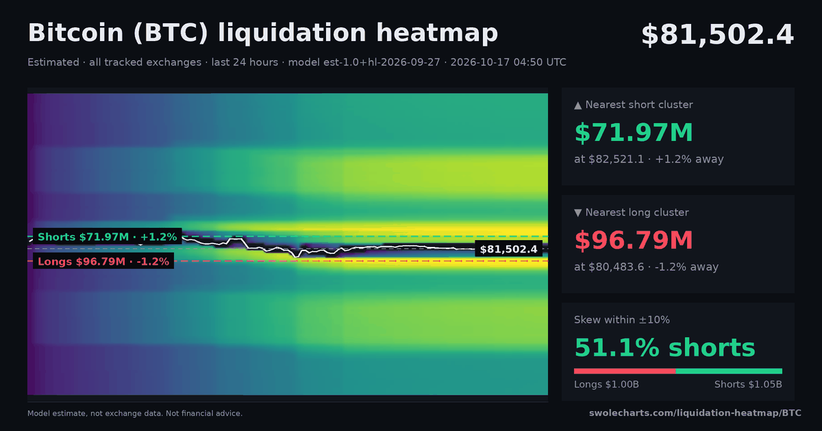
The card above is the BTC liquidation heatmap (an estimate). For the measured counterpart, open the BTC liquidity heatmap.
How a liquidation price arises
A leveraged position is liquidated when its margin falls to the exchange's maintenance level. In a simplified form for an isolated-margin linear perpetual, with leverage L and maintenance margin rate MMR:
- Long: liquidation price ≈ entry × (1 − 1/L + MMR)
- Short: liquidation price ≈ entry × (1 + 1/L − MMR)
This is the form Bybit publishes for isolated USDT contracts, with maintenance margin valued at the entry price. It leaves out fees, tiered maintenance margin and cross margin. Exchanges trigger on the mark price, not the last trade; Hyperliquid's documentation describes its own maintenance margin and mark price rules. See the liquidation price and maintenance margin glossary entries.
Illustrative example: synthetic numbers, not live data. A long opened at $100,000 with MMR 0.5%:
- At 10x: 100,000 × (1 − 0.1 + 0.005) = $90,500, about 9.5% below entry. The matching short liquidates at $109,500.
- At 50x: 100,000 × (1 − 0.02 + 0.005) = $98,500, only 1.5% below entry. The matching short liquidates at $101,500.
Higher leverage puts the liquidation price closer to entry. The liquidation price calculator values maintenance margin at the liquidation price instead, so it gives $90,452 for the same 10x long; its Bybit version uses the formula above.
How the estimate is built
Nobody outside an exchange knows every position, so the site's liquidation heatmaps follow four plain steps:
- Opens. Every rise in open interest is booked as a new long and a new short at that period's volume-weighted price.
- Leverage mix. Each new position's liquidation price is spread over a distance-from-entry distribution measured on real Hyperliquid positions: longs below entry, shorts above.
- Closes and decay. Falls in open interest close positions proportionally, and all positions fade with a half-life because most are closed without being liquidated.
- Clearing. When price trades through a level, those positions count as liquidated and the level is removed.
Known limits: the result is not a record of real positions, because exchanges do not publish positions. Cross margin, hedges and partial closes are unobservable, and opens and closes inside one open-interest snapshot cancel out. The methodology and accuracy scoreboard compares the model with real liquidations from the exchanges' public streams, such as Bybit's all-liquidation stream, and publishes where it does not beat a simple baseline.
Reading the chart
Colour is the estimated USD at risk in each price bin: brighter means more. Long levels sit below the current price and short levels above it. A cluster marks where a move could cascade into forced orders if the model is right; it is not a prediction that price will go there. The BTC liquidation levels and BTC liquidation max pain pages give the same estimated numbers as text.
Liquidity heatmap: reading resting orders
A liquidity heatmap colours each price and minute by the USD value of limit orders resting in the book: bids below the price, asks above. These orders really existed, but they can be cancelled before price arrives, and each column is only a snapshot. The bands are narrow: for dense books such as BTC and ETH, the returned levels reach only about ±0.15–0.4% around the price. Order-book depth explained covers bands, imbalance and slippage.
Common mistakes
- Treating a bright liquidation band as real orders or real positions. It is a modelled estimate.
- Reading a cluster as a price target. The site makes no predictive claim; check the validation scoreboard.
- Assuming a liquidity wall will hold. Resting orders can be pulled at any moment.
- Comparing heatmaps from different sites as if they measured the same thing. Their assumptions differ.
- Using a heatmap instead of your own position's liquidation price. Use your exchange's figure or the calculator.
For the levels still open now rather than their history, see the liquidation map.
Checked against the exchanges' own documentation on 17 October 2026: Bybit: liquidation price (USDT contract) · Bybit API: all liquidation stream · Hyperliquid docs: liquidations. Not financial advice.